
The Miami Association of Realtors has offered the City of Miami Springs another grant opportunity that involves a city name sign to be placed at a location the city chooses. There are three key decisions to make:
- Do we want these signs? Yes or No
- If yes, which of the two design options do you prefer?
- Where should Miami Springs place the sign?
To answer question number one, you should know that the grant from the Miami Association of Realtors would cover the bulk of the cost. The city would still be responsible “for the concrete pad required to install the sign as well as placement of 1-2 park benches in the vicinity in order to create a community and visitor gathering place for pictures, and lighting for the sign.” The city believes it’ll cost under $3,000 to complete the project.
QUESTION #1:
Should the City add one of these signs? Yes or No
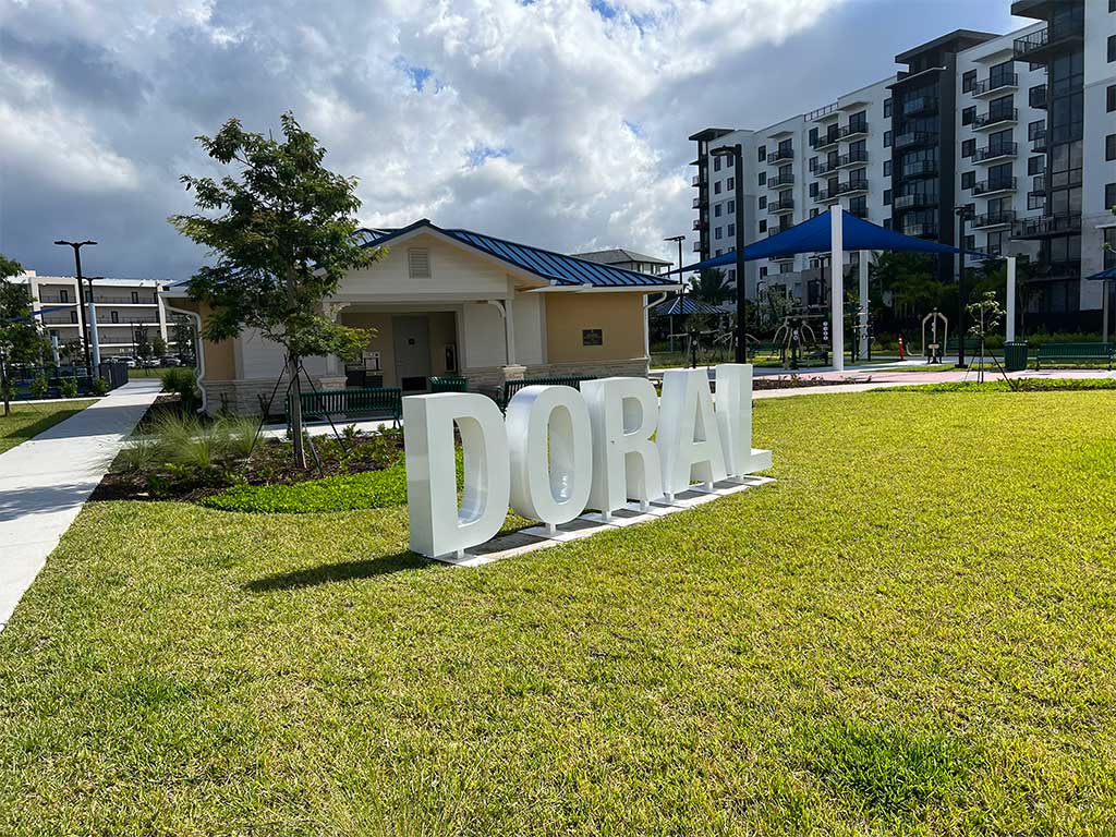
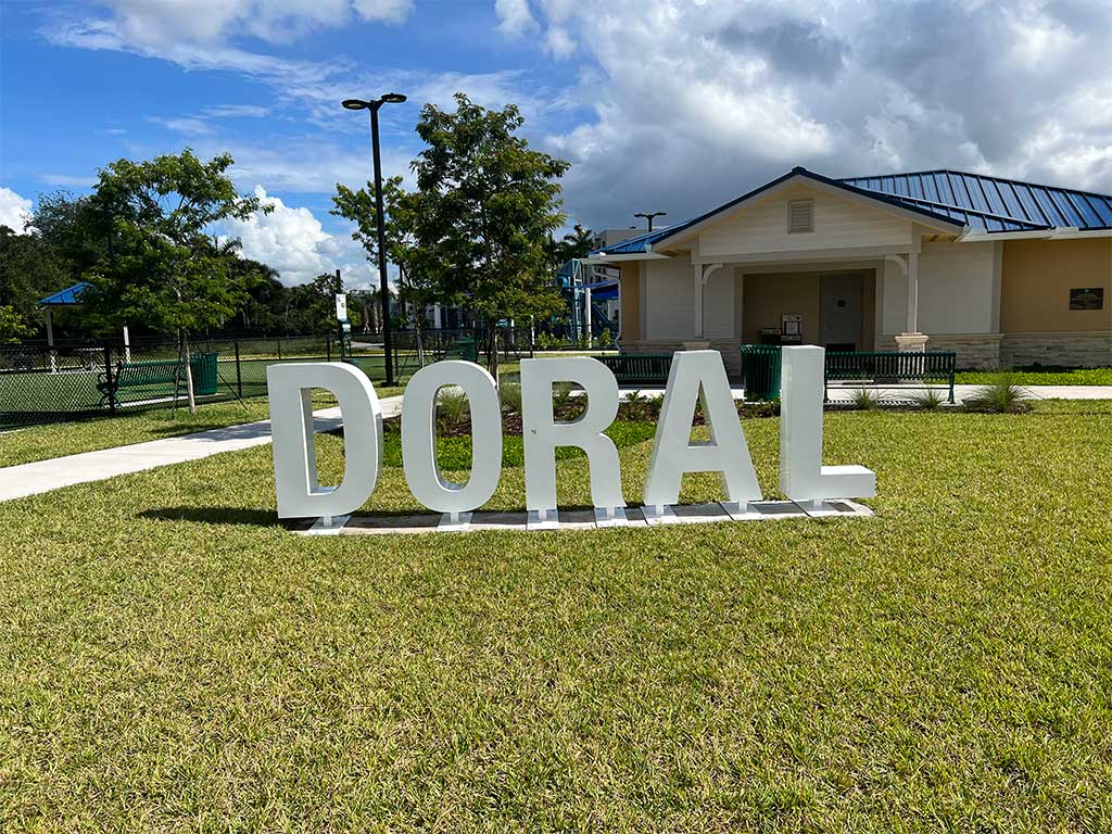
As an example, here are some pictures of similar signs the Miami Realtors worked on in the City of Doral. (Photo Credit: Jorge Santin)

At Monday’s City Council Meeting, the Council appeared to be in favor of receiving the grant from the Miami Association of Realtors for the sign. But the City Manager was pressuring the City Council to give him an answer on what sign and what location quickly. Unfortunately, we don’t think it’s wise to do this without receiving input from the Community. Personally, if I were putting up a sign like this, I’d mock up one out of cardboard and move it to the various locations. Sometimes things look okay or even great by itself, but when placed into a location with scale and background, it may not fit well.
One more thought before we move onto the next question. Just because someone is giving something away for free doesn’t mean we have to accept it. Especially if we don’t think it’ll fit properly within our community. I’m not entirely sure yet.
QUESTION #2:
Which design style do you prefer? Stacked or Wide?
The City administration shared two options for the Miami Springs sign.
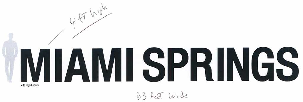
Option 1: STACKED
As you can see below, this sign minimizes the “MIAMI” portion of the City’s name and emphasizes “SPRINGS”. It’s also very tall. The stacked version below measures 18 feet wide. The lettering for SPRINGS are 4 feet high. It appears the letters for MIAMI are approximately 2 feet tall making the combined structure close to 6 feet tall or close to the height of a 6 foot person. This sign takes up less real estate because it’s not as wide as option 2 further below.
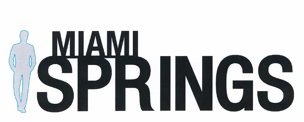
Option 2: WIDE
As you can see below, the wider option emphasizes both parts of the City’s name: “MIAMI SPRINGS”. It is considerably wider at 33 feet wide with a height of 4 feet.
QUESTION #3:
Where does a sign of this scale fit properly and provide the greatest impact?
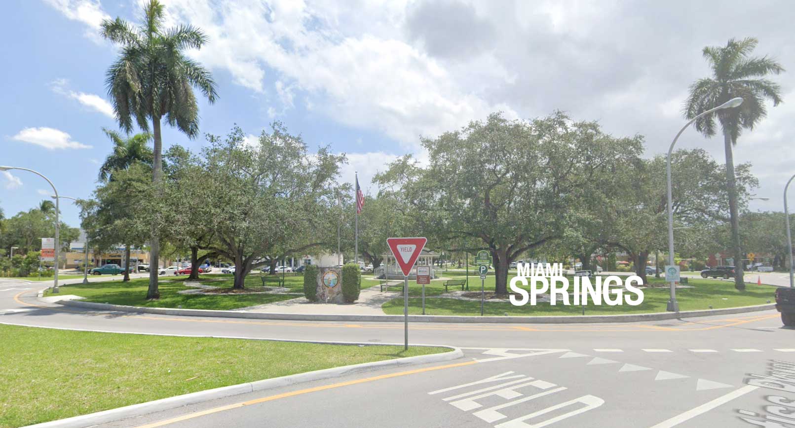
The City provided some locations where these signs could be included like the Circle, Curtiss Parkway (near the Circle), and along Curtiss Parkway near the Golf Course. However, it’s very difficult to get an idea of what it might look like without some kind of mockup.
So, to help you get a feel for what the Miami Springs signs may look like at these locations, we mocked up the two signs and super imposed them at the corresponding locations. What do you think? Do they look appropriate at these locations?
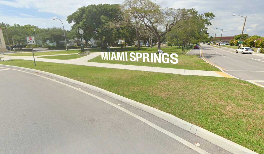
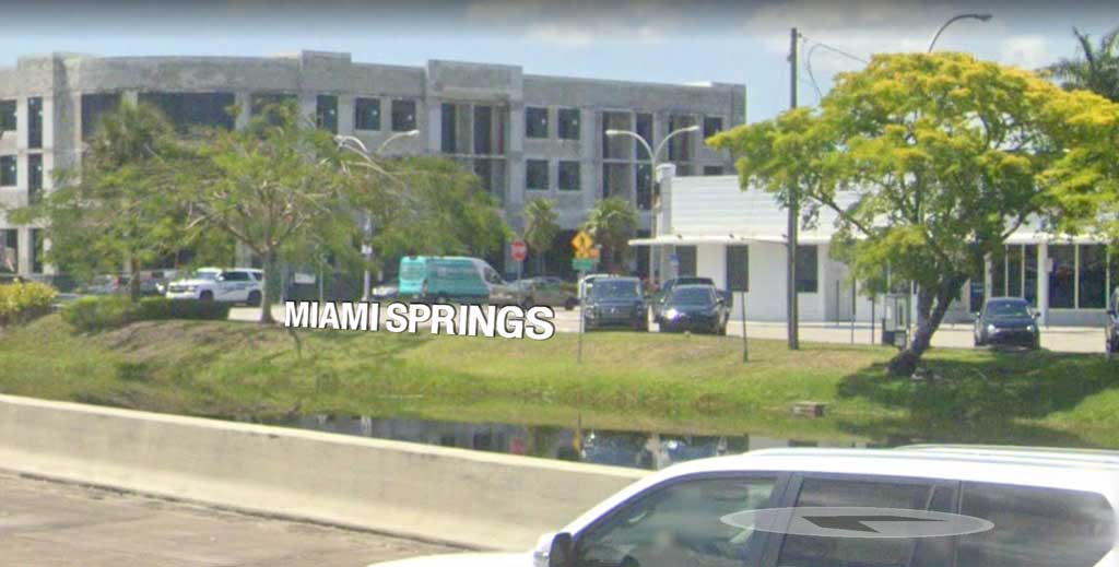
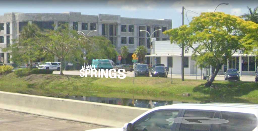
Miami Springs Circle
Entrance to Miami Springs (Stacked Sign)
Entrance to Miami Springs (Wide Sign)

Miami Springs Circle
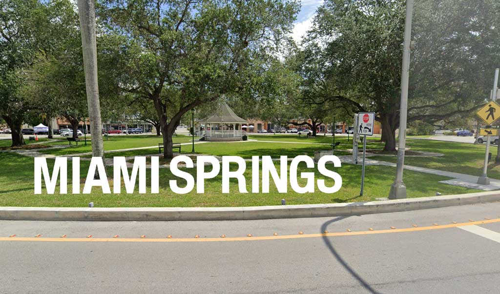
Near crosswalk (stacked sign)
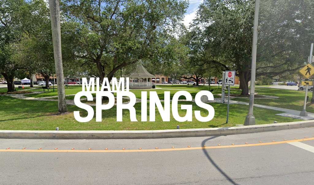
Near crosswalk (wide sign)
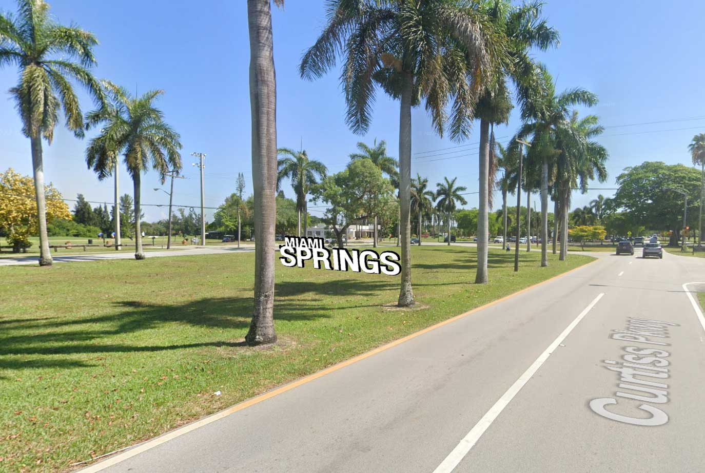
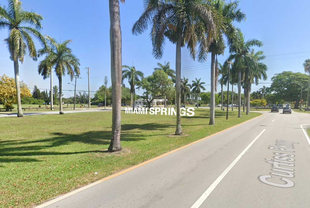
Curtiss Parkway Median Near Circle
Near crosswalk (wide sign)
Near crosswalk (stacked sign)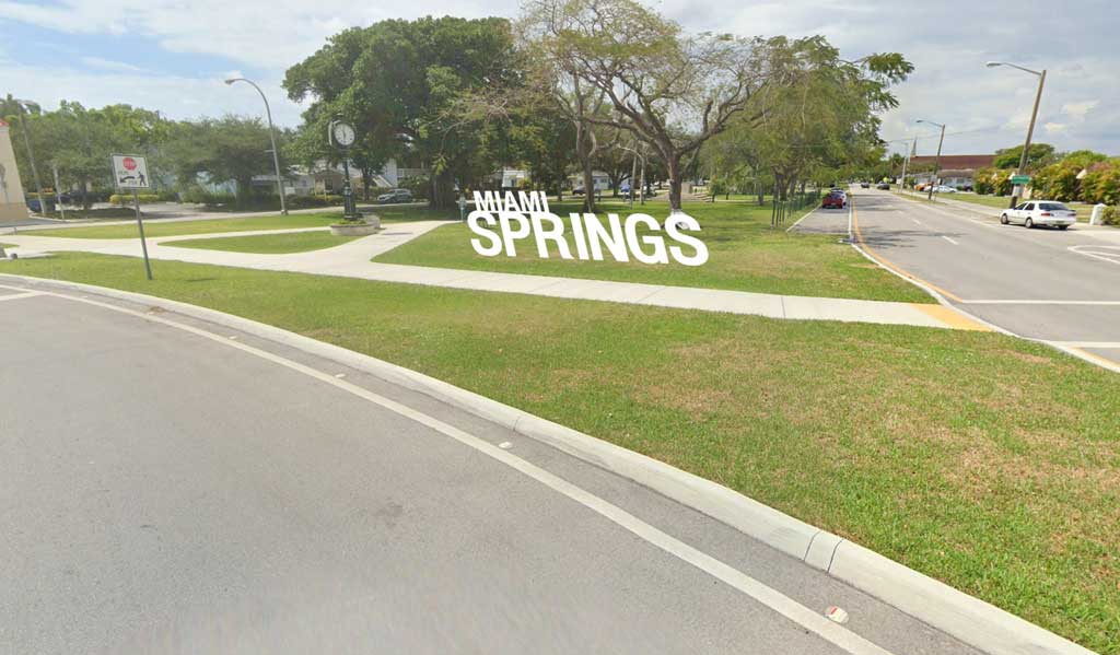
Curtiss Parkway Near Golf Course
Stacked Sign
Wide Sign
Canal Street / Okeechobee Road
We added an area that we believe will have the greatest impact of all. Canal Street. Not because Canal Street gets thousands of drivers daily. But because the banks of the Miami Canal faces U.S. Highway 27 (aka Okeechobee Road). Adding a Miami Springs sign that faces Okeechobee Road will brand our community to far more people than any sign along Curtiss Parkway.
Furthermore, the size of the sign lends itself to being seen from a distance, like say, across the Miami Canal and 6 lanes of traffic. And this is the only location that will create a reflective version on the water. From a branding standpoint, it’s hard to beat a Miami Springs sign along the Miami River Canal.
As for which sign do we prefer. We think the wide version provides the best branding for Miami Springs. We’re not just Springs. We’re Miami Springs. Springs without Miami makes people confuse us with Coral Springs. It’s important to say our full name: Miami Springs.
NW 36th Street?
A long time ago, before the LeJeune Road Overpass to Okeechobee road, there used be a a larger parcel of land between LeJeune Road, NW 36th Street, and South Royal Poinciana Boulevard. This triangle hosted a two story Miami Subs restaurant and Baskin Robbins. At the corner of this triangle, there used to be a sign, just like we still have on the Circle with the Seal of the City of Miami Springs indicated you had entered our city. Today, that sign is gone and has been replaced with illegal commercial banners as depicted by the Salsa Festival banner shown in the screenshot below.

I don’t know if the new sign proposed above would be good for this location, but we should consider adding a Miami Springs sign somewhere on this property to help indicate to the vast traffic that traverses this trail that they have entered Miami Springs.
MIAMI SPRINGS SIGN RECAP
- Should the City add a Miami Springs sign?
- If yes, which sign to you prefer? Wide or Stacked?
- Which location is best?
- Canal Street
- Circle
- Curtiss Parkway near Circle
- Curtiss Parkway median near Golf Course
- NW 36th Street
THOUGHTS? FEEDBACK?
The City Manager asked for the Council Members to provide feedback by the end of the week. We’re not exactly crazy about the Council deciding this via emails to the City Manager. The branding of our City is too important to be rushed before the 4th of July Weekend. In addition, residents should be given an opportunity to provide their own ideas of the best place to add this sign. Heck, they should be given an opportunity to express their support and/or their opposition to adding this type of branding to our City.
We want to hear from you? Do you think these signs belong in our city? And if so, where? And if not, why not? Please, feel free to share your feedback in the comments section below or via social media.


In my humble opinion, I believe the single line, wide sign is better than the stacked. However, I also believe that one sign is insufficient for branding the city. If I were in the decision making position, I would propose a sign at both the Curtis Parkway/Golf course entrance and the Canal Street entrance. This would be a better branding logo for those who are not long-term residents.
Further, I also believe that it would be a better decision to wait until after the Fourth of July, to allow a community opinion.
Most importantly, which ever location is chosen, I would strongly recommend the word, ‘HISTORIC’ be added on top of the stacked version.The size of the word, ‘HISTORIC’ should be similar to the proposed ‘MIAMIi’, as in the previous suggestion.
Miami Springs has an important historic legacy, one which should not be overlooked or omitted.The birth of commercial aviation was very significant to the nascent community, as well as the explosion of real estate development. These factors should be presented to the population of the city before any final decision is made.
Dear Mr. Beegeezy, I have an idea, instead of writing these letters from the safety of your anonymous keyboard, why don’t you attend a council meeting in person and tell them what you think.
This is the second article that I have read and commented on from this website. I am again impressed with the remarkable lack of proofreading, and this time it is certainly coming from the so-called editor. Wow, just look at all of the advertising I had to wade through just to get to the comment section. I find it amazing how so many of the wealthy people of Miami Springs have all of this money to throw around, and yet so far, nothing that I have read on this website has been written in proper English. Nestor Suarez, Leonard Real Estate, Concepcion Law, and all the rest of you adults, if I were in your shoes, I would be embarrassed. You people pretend at class. You people are the ones with tacky stone lions in front of your houses, and now you want to impose your poor taste on the rest of us with these stupid ideas. You people are destroying the beautiful aesthetic of our town.
Nestor Suarez, you should contact City Hall and tell them that Beegeezy is unhinged. I am half French and half Cuban. I love freedom, I love my country, and I love this town too much. We have given up too much to be here. Nestor, I am begging you to stop trying to wreck our town. Got it?